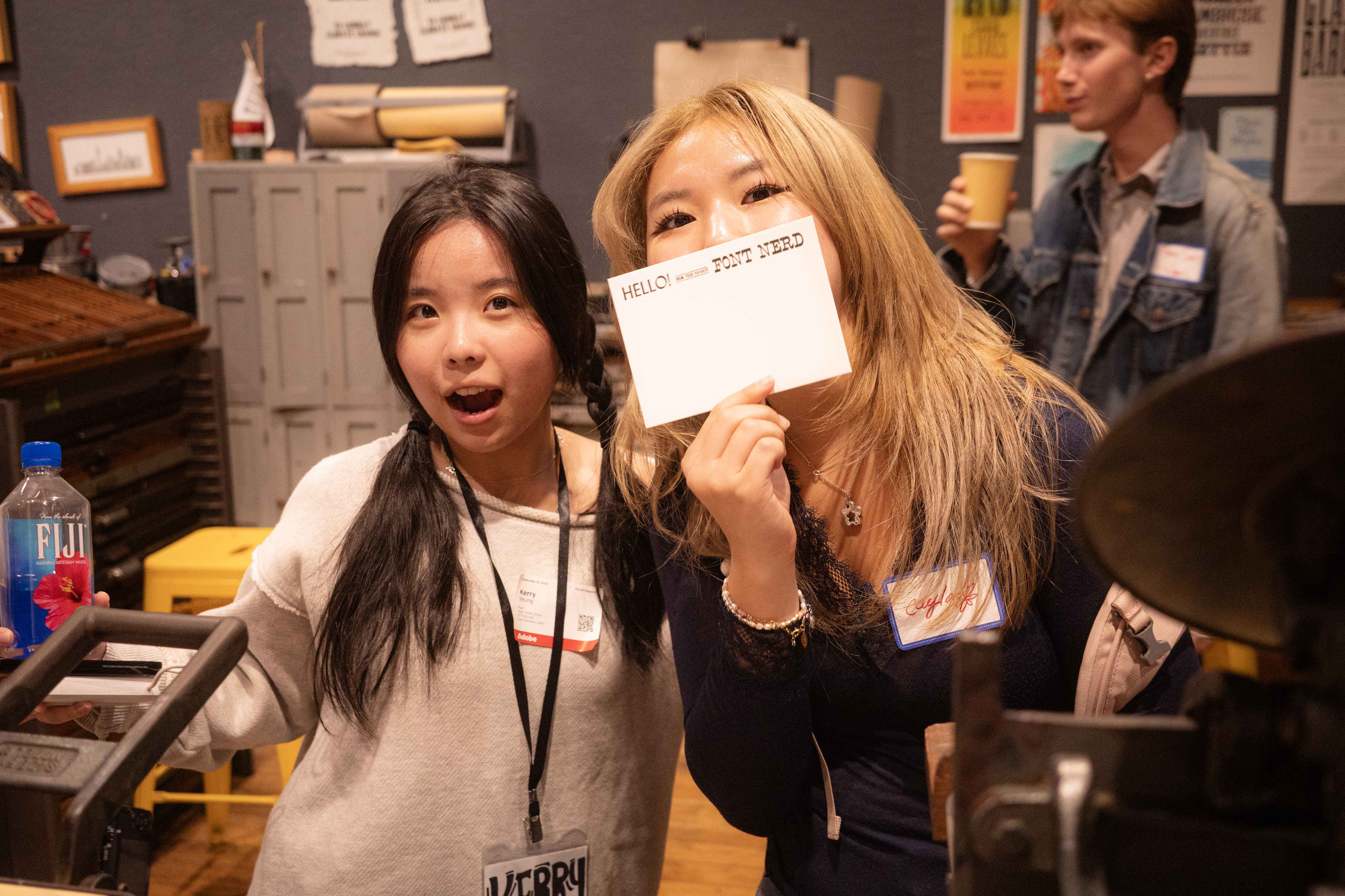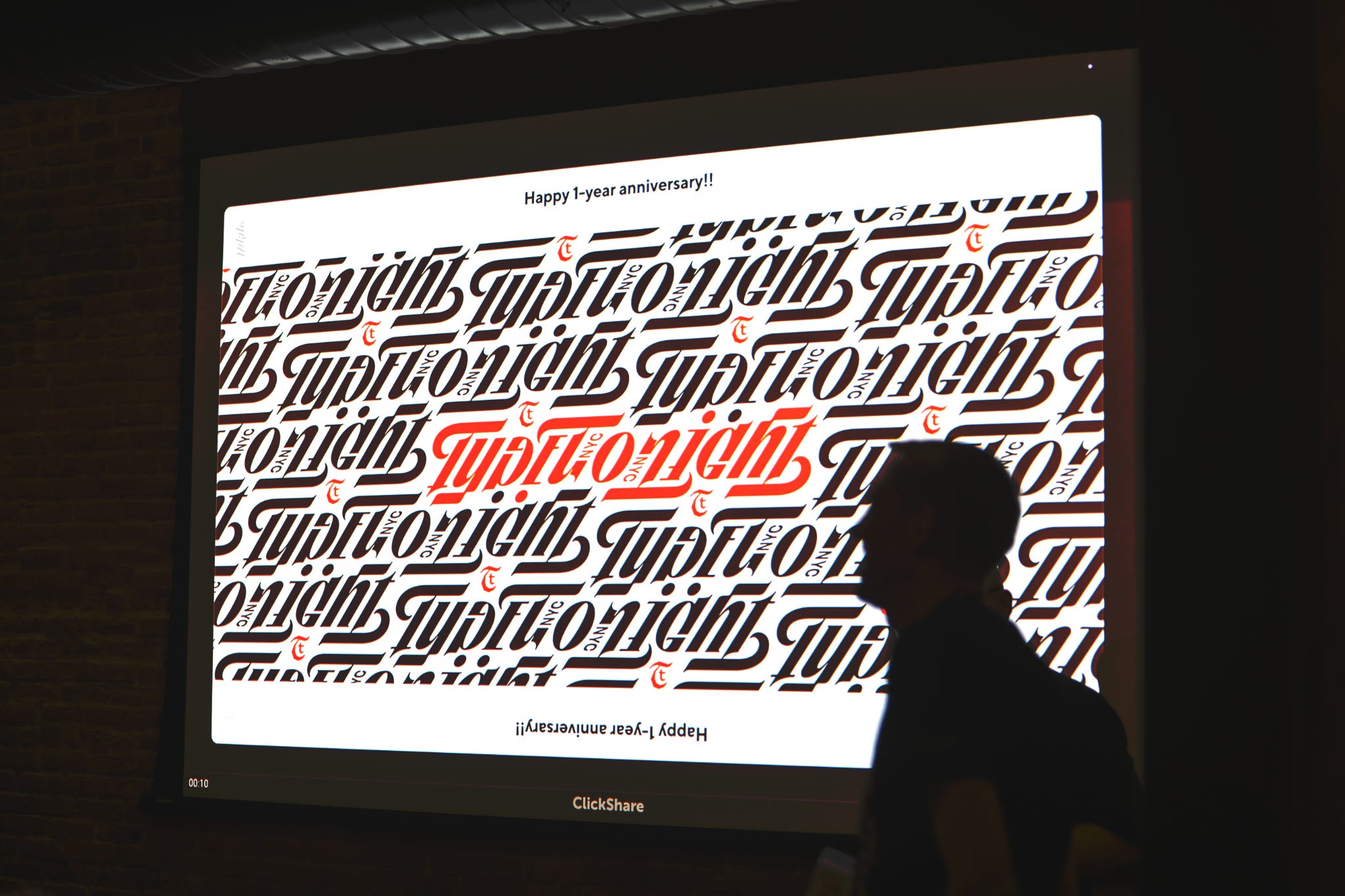
It was only right for Type Tonight to start its one year anniversary with a charming (and slightly off pitch) sing along of “happy birthday to .. us?”. Our September crit celebrated our one anniversary! But before we passed around cupcakes we had a great run of presentations.
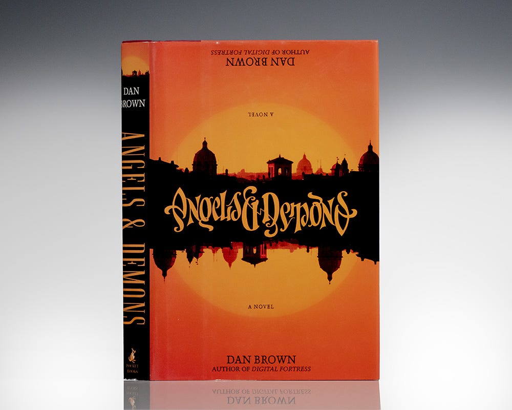
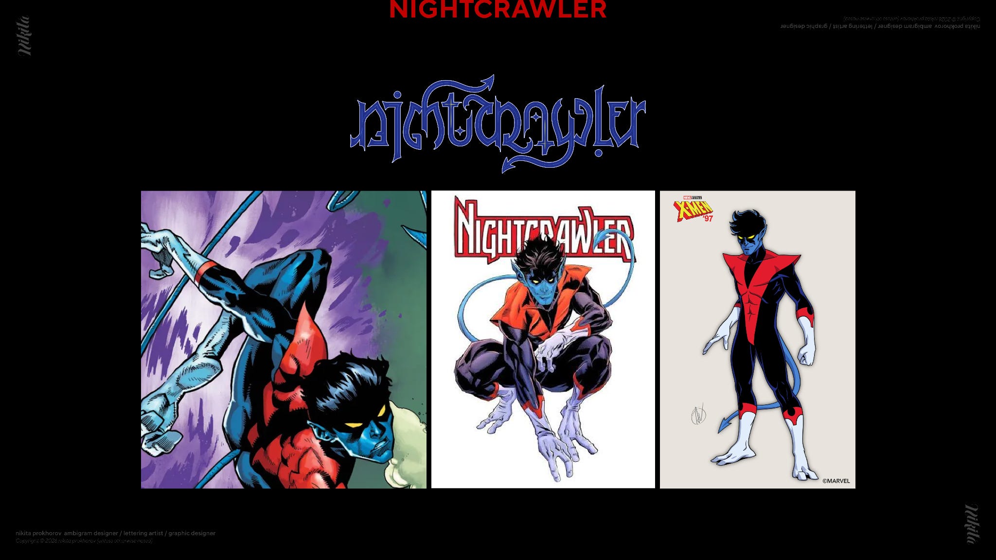
Our first presentation of the night was all about the duality of letterforms with Nikita Prokhorov. Nikita first became interested in ambigrams in 2008, when he walked into the Strand and saw the best selling title “Angels & Demons”. An ambigram is when a word can be read from both right side up and upside down. After years of lettering, this ying and yang quality of the title captivated him so much that he started to hone in on ambigrams specifically.
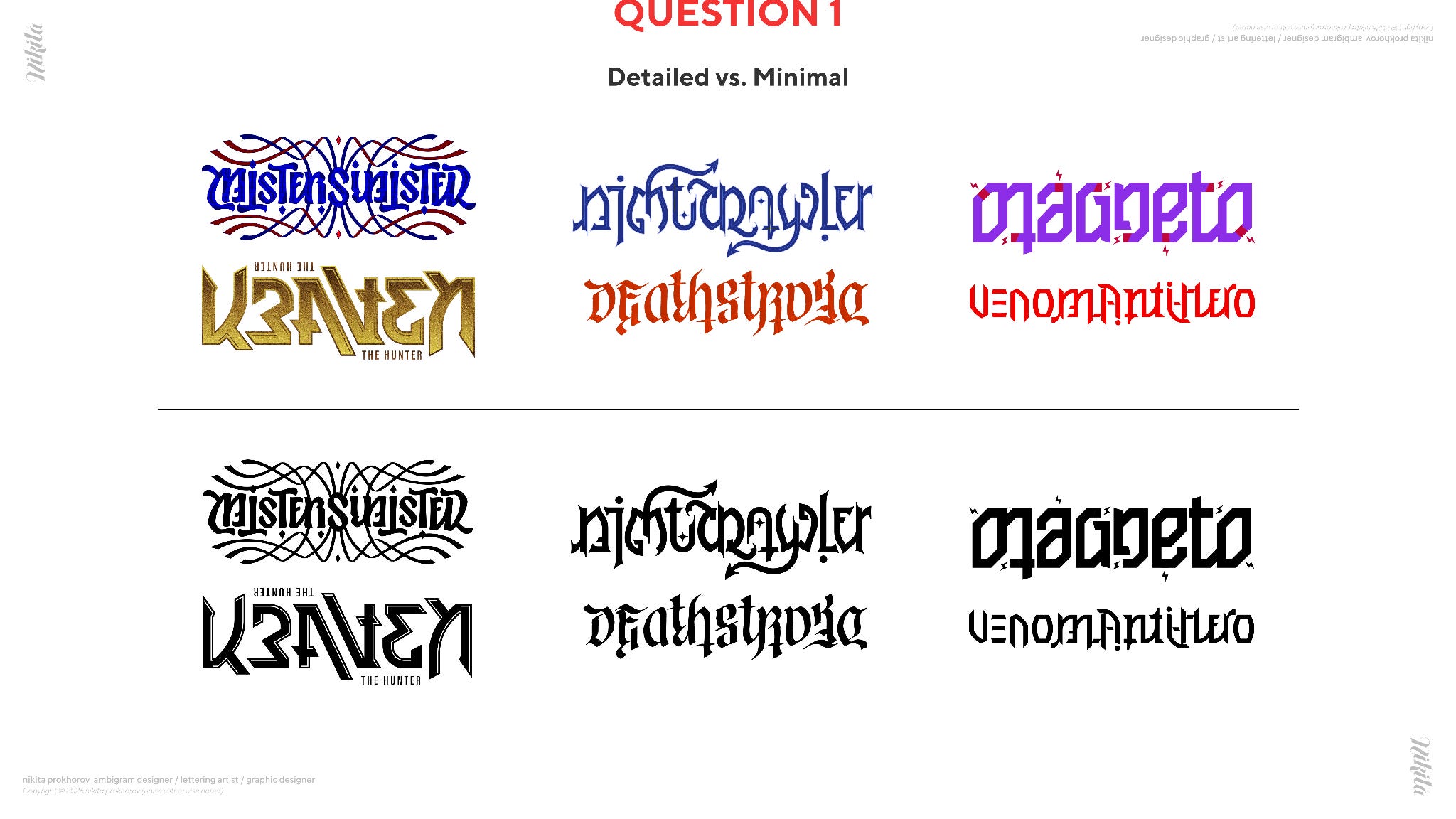
Through his love of comics, he explored ambigrams by communicating character attributes through expressive lettering. Nikita’s hope is to use his ambigram works as a way to help brand comic characters. The two main questions for the audience were 1) how complex or minimal should the ambigrams be? Should they be vectorized? and 2) how should he go about sending his work out to entertainment studios?
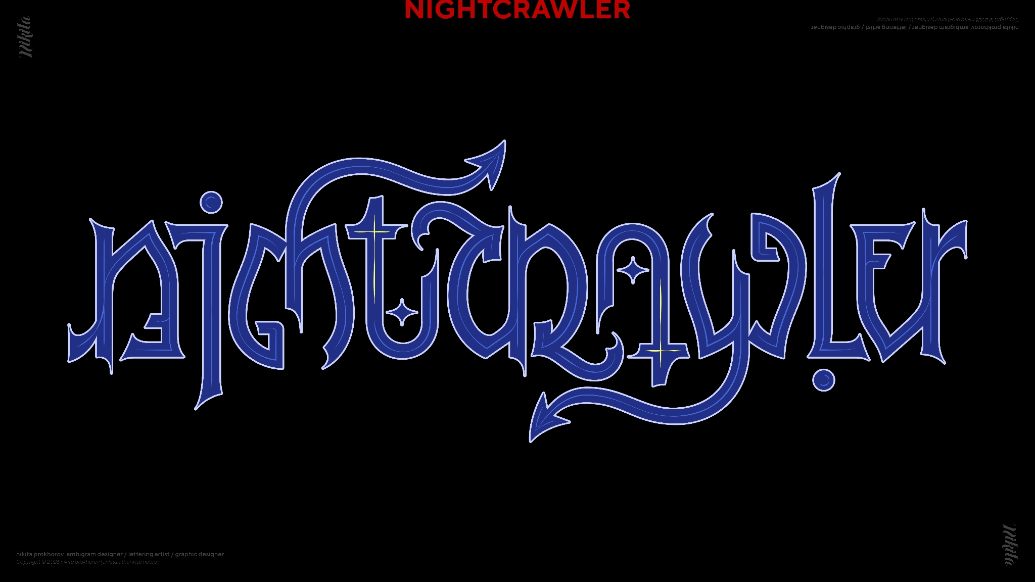
Overall, the audience agreed vectorized wordmarks would go further in the branding world due to how easily scalable and versatile they’d be on different sizes and textures. For pitching work, the audience prioritized comping up more of the ambigrams in a variety of different use cases, as well as sending out physical copies whenever possible.
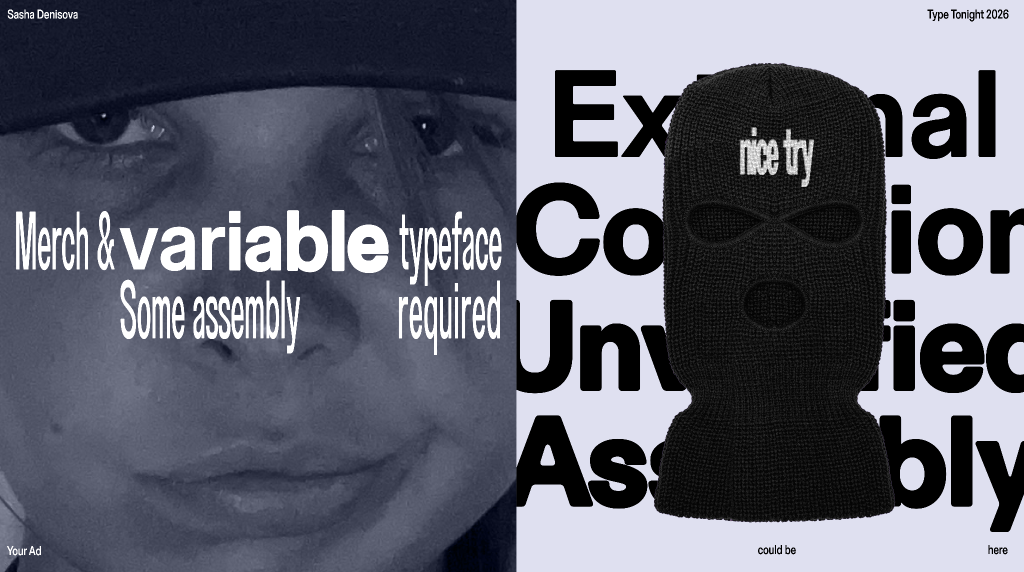
Our next presenter was Sasha Denisova (who you can read more about in our previous Q&A). Outside of her day job as a brand designer at night Sasha turns to type design. She’s designed a number of typefaces ranging from serifs to tech inspired displays, but for this presentation the focus is on her new axis variable typeface Nice Try.
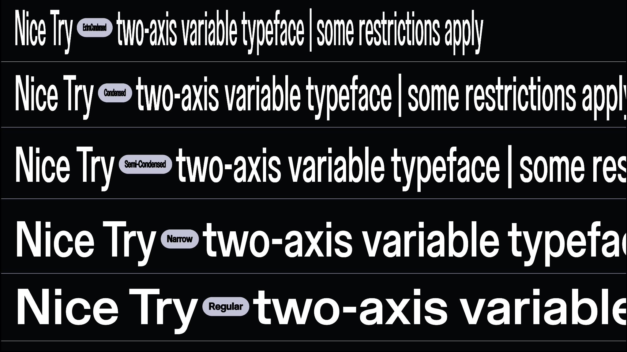
281 glyphs and 10 masters in the making, Nice Try is meant to embrace fluidity and demand attention. With custom characters and combinations that speak to the ever changing digital landscape we find typography living in.
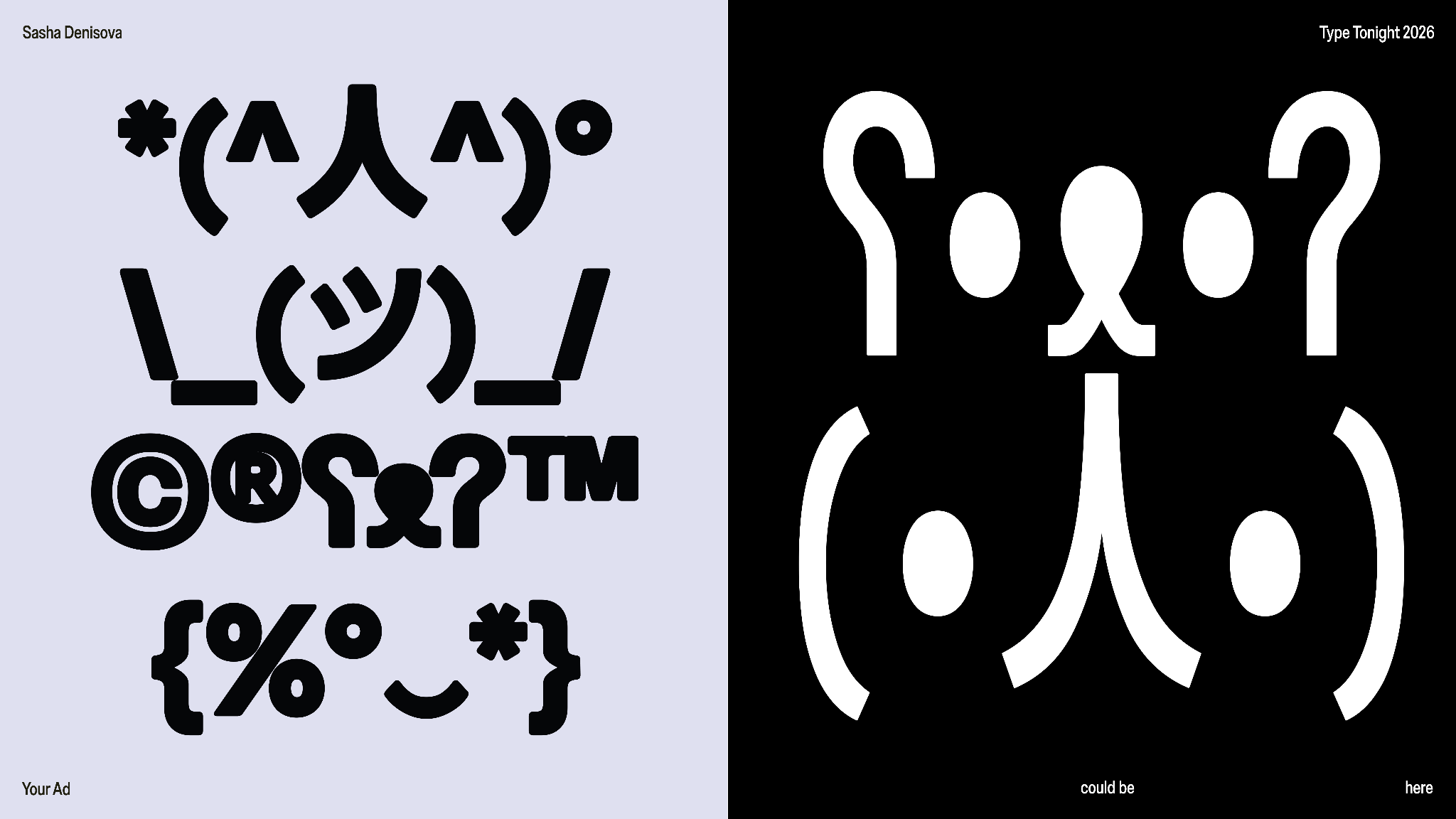
The branding behind the typeface shared the spotlight during the presentation. The look and feel was inspired by the traditional sales-y graphics that often bombard life in New York. Using familiar phrases like “limited time offer” and making not just t-shirts but also a stylish ski mask, the branding pokes fun at consumerist behavior.
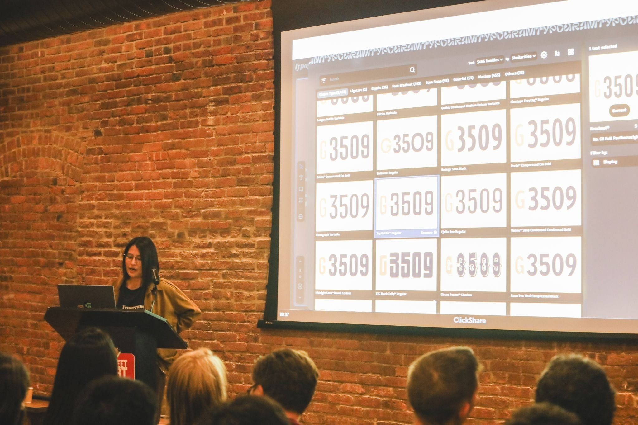
Our final presentation was a spotlight on Typogram Studio and how to use Typogram to create and layout a design forum in magazine form. The presentation was an interactive demonstration with Typogram co-founder Wenting Zhang.
Our next event is tomorrow(!!) Friday October 22th 7–9 pm at Bowne & Co., 207 Water St, NY, Tickets are $10 and can be reserved here. More details and upcoming presenter Q&As will be coming shortly, but get excited to hear presentations on type design inspired by bacteria (scary we know), redesigning an iconic horror story, and developing new type design software.
Looking ahead to November we have our monthly crit event on Friday, November 13 and an interactive letter hunt walk on Saturday, November 14 (details to come!)